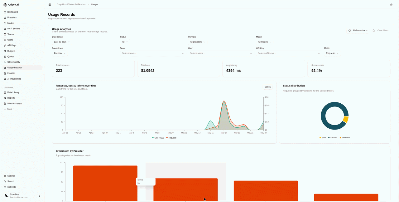
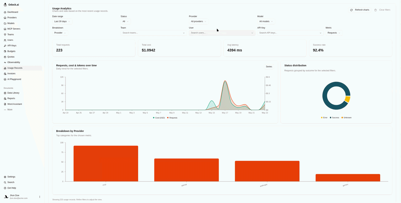
Usage Analytics
The analytics card that sits above the Usage Records table.
Usage Analytics
The card at the top of the Usage Records page is for the how is my organisation trending question. It loads recent usage records, applies your filters, and renders four KPI cards plus three charts.
Workflow
Open your organisation workspace.
Open Usage Records from the sidebar.
Pick a Date range (7d, 30d, 90d, 12 months, or all loaded).
Use Status, Provider, and Model to narrow what the analytics consider.
Use Team, User, and API Key to attribute the analytics to a specific principal.
Pick a Breakdown dimension and a Metric to drive the bar chart. Metrics include requests, cost (USD), total/input/output/cached/reasoning tokens, and Units — the per-unit quantity (e.g. OCR pages) for endpoints billed per unit rather than per token.
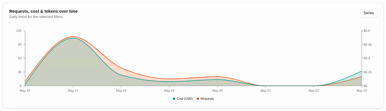
Use the Series dropdown on the time-series chart to toggle requests, cost, token, and units series.
What The Cards And Charts Show
| Element | Reads |
|---|---|
| Total requests | Number of records after filters. |
| Total cost | Sum of cost in USD. |
| Avg latency | Mean latency in milliseconds. |
| Success rate | Share of records with a 2xx/3xx status. |
| Time-series chart | Daily trend for the selected series. |
| Status donut | Success, error, and unknown share for the selected metric. |
| Breakdown bar chart | Top categories for the chosen breakdown dimension. |
Tips
The Clear filters button resets everything back to defaults.
The Series choice is remembered between visits. Add the cost series alongside requests once, and it stays on for next time.