Latency
How slow it is, what shape the slowness has, and when the tail fires.
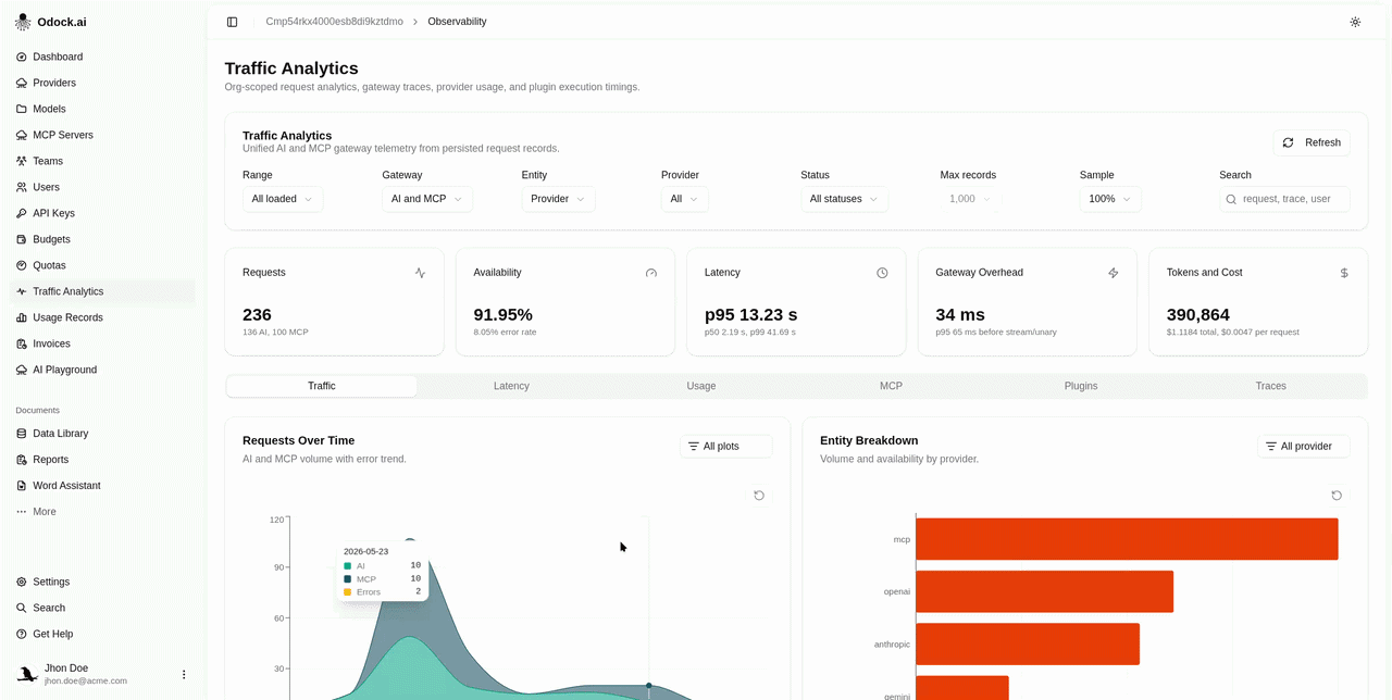
Latency
The Latency tab is the why is it slow view.
Visualizations
| Chart | Answers |
|---|---|
| Latency Trend | Is it getting worse? Daily average latency with gateway overhead overlaid on a second axis. |
| Latency Distribution | Where is the mass? Bar buckets from <250ms to >10s. |
| Latency Heatmap | When does the tail fire? Day-by-hour grid split by latency band. |
The two lines on Latency Trend are intentionally on separate axes. A jump on average latency with a flat gateway overhead is upstream. A jump on gateway overhead with a flat average usually points at a plugin or safety module — see Plugins.
Workflow
Open this tab when the Latency KPI card on the header shows p95 climbing.
Read Latency Trend first — average vs gateway overhead tells you which side of the gateway is slowing down.
Read Latency Distribution — is the whole distribution shifting right, or is a new tail bucket growing?
Use Latency Heatmap to check whether the regression is constant or hourly.
Switch to the Traces tab, sort by latency, and open the worst offender for a per-request inspection.
Tips
Filter the page to one Model before looking at the distribution. Mixing models with very different generation lengths makes the distribution chart hard to read.